Flaneur
Project Managment, UI/UX Development, Visual Design, SEO Optimization, Brand Development, Copywriting, Frontend Web Development
Flaneur is a luxury e-commerce bedding company specializing in dyed-to-order sheets, pillowcases, duvet covers, and more.
This project involved completely revamping the Flaneur brand and web experience from the ground up.
We created a luxurious and surprising online experience with a highly integrated brand presence.
I managed the project with a third-party development team working on the backend while I designed the user interface as well as selected the tech stack that powers Flaneur.
In my on-going role, I maintained the Flaneur website, implemented changes based on data, conducted SEO exercises, as well as established brand codes.


Flaneur: Wireframing and Prototyping for a Scalable Product
Mindful of the core demands of a growing luxury ecommerce brand as well as being respectful of industry conventions, I started with basic journey-mapping and logic testing before graduating into basic mockups and static prototypes.
We considered the viewpoints of repeat customers, the roadmap of the company, as well as state of the industry as we developed the features of new Flaneur site.
At this point, I led the team on determining where the brand sat in terms of industry perception as well as exploring opportunities to graduate the brand from being a startup to being a young luxury name.
I made decisions on designing features that allowed for scaling into multiple bed-related products as well as peripheral interests such as a garments and other home goods, while also satisfying baseline luxury e-comm expectations, such as a proprietary real-time order tracking system, managed directly by dye-house staff.
Review the case study on the UI/UX for Flaneur here.

Flaneur: Owning the Digital Color Experience
One of the most challenging parts of the Flaneur project was communicating the bespoke and genuinely individual character of color. And, given Flaneur's known inventory of 2,500 colors, we needed a way to narrow down a customer's focus.
With that in mind, I created digital products within Flaneur's website that connect individuals with colors in a meaningful and memorable way.
With the swatchbook, we allow instant comparison of colors and palettes with React Router's single-page app architecture. People can interact with color in a direct manner.
With the curated color schemes, we are aiding people in reaching a purchase, while inviting experimentation and exploration.
We also began an initiative of linking colors to specific reference points, often art or travel destinations. This token of relation is a way to allow the customer a story of acquisition and a link to history.


Flaneur: Tech Stack and Project Management
Leading a team of developers and directly collaborating daily, the new Flaneur website was completed at budget and on-time. Vetting and selecting the development team involved clear communication of goals as well as seeing their understanding of the core values of Flaneur.
Selecting a tech stack involved intimate understanding of how each component functions individually and as a single system. I chose products that are known to work together and have strong support systems.
"We had a tight budget and ambitious scope, but with his help in coordinating with his team, we were able to launch the site on time and on budget. It's rare that you find someone who can navigate technology choices, communicate with an internal and external team, manage a project, *and* do front-end theming in tandem with developers also working on a web project. This guy is a triple (quadruple?) threat! I highly recommend Benjamin. He was a joy to work with and for."
Casey Cobb, Principal at Project Ricochet
The entire Flaneur site has been designed with mobile-optimization taking place during development, not as an afterthought, resulting a satisfying experience across screen sizes.

Flaneur: Continued Improvement Based on Data
As the bulk of this development project came to end, I devoted significant time toward improving the user experience on-site, making design decisions based on business goals and use data.
I also focused on the search engine optimization of Flaneur's site, ensuring proper indexing as well as improving appearance in peripheral search queries.
The result of a comprehensive SEO overhaul was a 2,000% increase in traffic acquired through search engines, as well as a 140% increase in impressions on search terms that did not directly reference Flaneur.

Flaneur: Total Luxury Brand Development
As a startup graduates from utilizing bootstrapped styles and generic brand identifiers to company-specific design codes and languages, careful preservation of the original value proposition is in order.
In my earliest work at Flaneur, I took time to build the basics of a brand guide both visually and tactically from stationery, brand languages, font books, photography guides, and even copies for when speaking to customers.
As a result, Flaneur's identifying brand assets will become more relevant and ever-present.


Bennett Leifer for Flaneur
Art Direction, Set Design
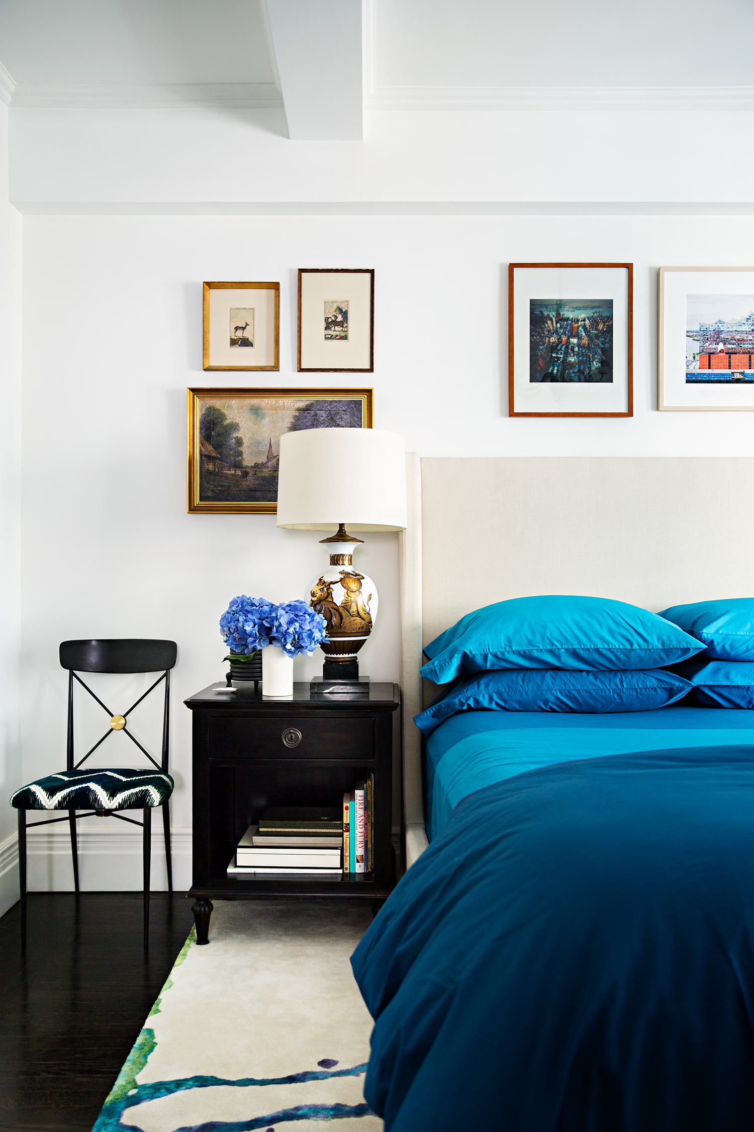
As part of my role as creative director at Flaneur, I worked with leading NYC and LA-based interior designers and photographers to shoot custom bedding collaborations with Flaneur.
This shoot necessitated angles that accommodated the rug which inspired the colorful bedding collection.


Heidi Merrick for Flaneur
Art Direction, Set Design
We were invited into fashion designer Heidi Merrick's LA home to shoot the bedding suit designed by her.
I styled this space and propped the bed in accordance with Heidi's aesthetic. The images are shot by Tim Street-Porter.


Flaneur's Tri-Color Tie-dye
Art Direction, Set Design
This limited-edition bed sheet set is shot editorially to tell the story of an artist becoming inspired and creating a fashion-forward bedding suite of custom bedding.
The collection was picked up by Coolhunting, Architectural Digest, and Domino.


Wash Label for Flaneur
Visual Design, Art Direction
Wash labels designed and delivered formatted for production. Variations presently appear on all products from Flaneur.

Flaneur Print Ad
Visual Design, Illustration, Copywriting, Art Direction, Print Advertising
This campaign focused on promoting specific colors and the individual stories behind them.
The illustrations and copies are inline with Flaneur's brand codes.

Flaneur Trend Forecasting
Visual Design, Illustration, Copywriting, Art Direction, Trend Forecasting
An opportunity to address the broader industry and situate Flaneur as a resource for color lovers, I designed a series of "color forecasts" that artfully explore color and insert Flaneur's bedding product in the context of cultural interests.


Flaneur Holiday Guide
Visual Design, Illustration, Copywriting, Art Direction, Social Activation
This campaign focused on promoting specific colored bedding products for the holiday season. The concept involves reimagining the holiday gift guide as a menu of options for a variety of tastes, with bedding inspired by a food item.
The illustrations are inline with Flaneur's brand codes.


Flaneur Holiday Pitch Imagery
Visual Design, Illustration, Art Direction
Industry-oriented imagery for an upcoming holiday pitch effort.
Digitally-manipulated imagery.


Flaneur Newsletters
Visual Design, Illustration, Art Direction, Copywriting
Examples of email correspondence for customers who are subscribed to Flaneur's emails.
I have created at least one hundred of these, each with original themes relating to relevant business needs.


Andela
Visual Design, Copywriting, UI/UX, Product Design
Supporting a growing talent acquisition startup through it's series C funding round. Utilizing the pitch deck during investor presentations, Andela managed to raise $40 million in the round. Along with the pitch deck design, copy, and data visualization, I worked with the engineering team to prototype the redesign of a series of internal products to demonstrate to investors the drive Andela was making toward UI/UX improvements.


Student Government, Inc. Rebrand
Visual Design, Illustration, Art Direction, Copywriting
In my position as the first-ever graphic designer at St. John's Student Government, Inc., I initiated my work with a comprehensive rebrand of the organization with $2 million in revenue.
The student board elected the sixth option and it is now printed on student wear, used on official letterhead, and more.


Celine
Art Direction, Visual Design
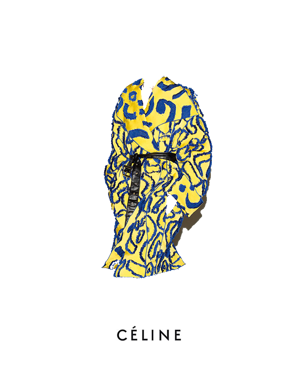
Celine is a high fashion brand that has become a legendary house known for designing immersive, thought-provoking designs.
Here I take image-manipulation in the direction of luxurious sparseness, allowing all eyes on the clothes.


Prada
Art Direction, Visual Design
These spare and tasteful "postcards" for Prada are designed to incorporate the interface of the clothing, literally. Designed to be small but durable, each card is loaded with detail, but leave the viewer on the hunt for more.


Timex
Art Direction, Photography
As part of a promotional effort on behalf of Timex, I directed and shot this photo journal of a day with the Timex "New England" timepiece, as well as wrote the copy for the story. The concept was known as “In The Office” and offers a slightly midcentury look at the classic watch. Copy examples:
The sun hangs low in the sky, a modernist office building accented by the people, steel beams, expanses of glass. You understand this beauty.
Sometimes it is easy to get lost in the details. When time is of the essence, so to is accuracy.
Verdant green and the golden hour, frequent breaks and a timely departure can help the hardest worker maintain tranquility.


Armani | Exchange
Art Direction, Photography
A shoot for this female watch toyed with shadow and the cubic character of the piece. I wanted to access the "cube" element of the timepiece by pairing straight lines and unconventional angles.


Internations
Logo Design, Visual Design, Copywriting
Internations was a conceptual financial product that sought to make it easier to engage with your money.
I was responsible for the overall look and feel of this brand along with developing compelling copy that was at once intriguing to those who were not familiar with the language but also stunning to those who do. The Internations campaign sought to invite non-investors into a space they could feel comfortable, but without insulting the intelligence of established investors. Placement of these ads ranged from backlit airport displays to webpages.


Typography: Tribeca Font
Typesetting, Visual Design
A fully mature brand can stretch out and develop a number of unique identifiers. For Nili Lotan, I developed a custom typeface for a new line of denim, as well as its logo and brand book.


Street Style Activation
Visual Design, Social Activation
In fashion, the street-styled look is an essential tool in the online promotional kit.
Here, we capitalized on celebrities wearing a selection of Nili Lotan garments.


Fendi
Art Direction, Visual Design
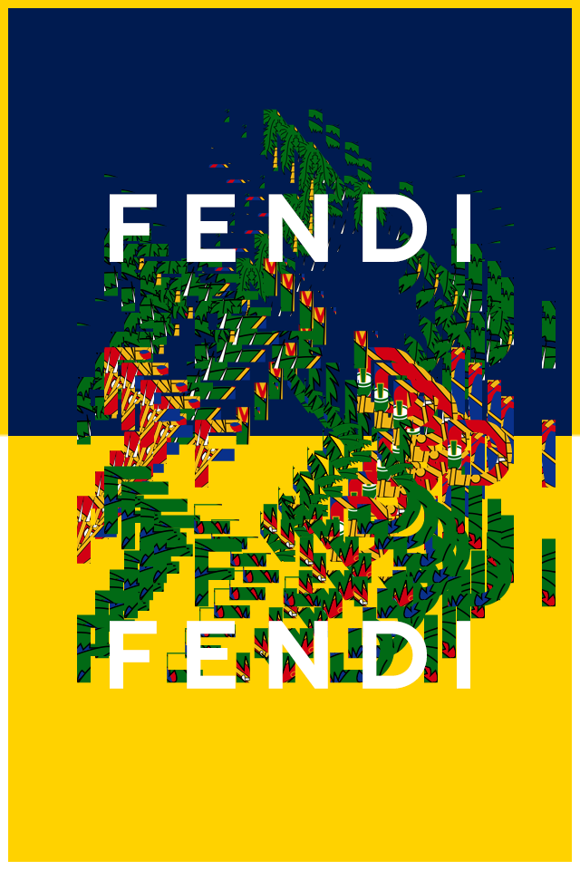
Working on a series of brand-enhancing social media features, I re-approached the Fendi logo with special attention to scaling and layering, as well as an elementary highlighting feature, offering a degree of innocence to this storied brand.


Cincinnati Art Museum
Visual Design, Art Direction
An invitation for an event hosted at the Cincinnati Art Museum, inline with new brand codes established the year before.

Misc. Logo Design
Visual Design
Here are a selection of logo designs including Christian Dior's sport line, Qantas Airways, University of Djibouti, a concert series, and the US Haitian Society.


Misc. Art Exercises
Visual Design, Art Direction
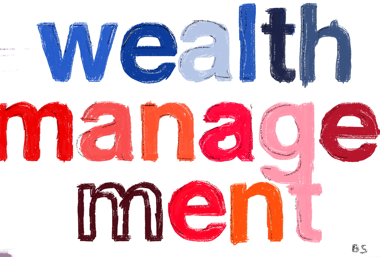
Explorations and experiments in color, shape, type forms, language, and realism.


